Year: 2022
Client: Paramount+ / Shine Iberia
Photographer: Jorge Alvariño
Assignment: International communication campaign for the BOSÉ series

Year: 2022
Client: Paramount+ / Shine Iberia
Photographer: Jorge Alvariño
Assignment: International communication campaign for the BOSÉ series
The claim carries a natural strength, including the I and BE to reinforce the idea of a biopic on screen. It is a powerful statement that appeals to the ability to generate a sense of belonging in the new generations.
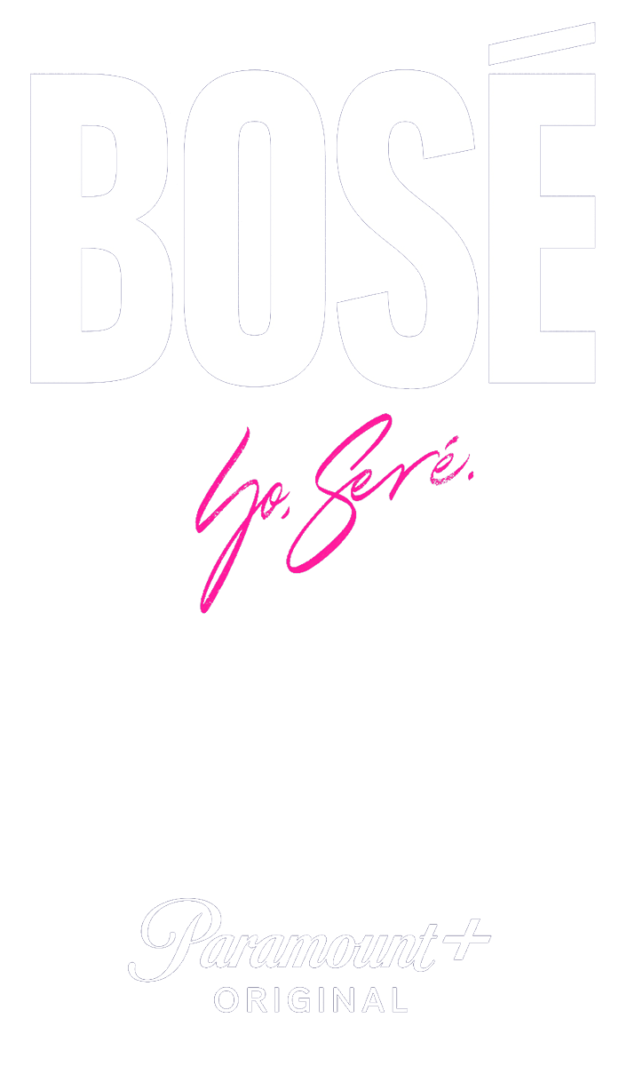

For the title of the series, we have chosen a simple but powerful typography. Starting with a bold and condensed design, we created our own graphic line that moves away from the style historically used by the artist throughout his musical career.
In the case of the tagline claim, the calligraphic choice was the only possible option to create a contrast with the title and keep referring to the same concept. The calligraphy guides the public directly to the artist, highlighting the biopic characteristics of the series, which is based on the artist’s own handwriting.